
Re-designing Ezetap’s Mobile POS Experience
Re-designing Ezetap’s Mobile POS Experience
As Ezetap’s client base grew across sectors like retail, banking, and government, the Android POS app, while functional, began to fall short. It got the job done but wasn’t the most convenient or enjoyable for merchants. On the other hand, banks (our biggest clients) weren’t seeing the desired profitability from the product.
In 2020, we decided to redesign the app into something much more than just functional. The goal was to create a modern, scalable platform that addressed the evolving needs of merchants and clients.
Timeline:
Sep 2020- Jul 2021
Team:
A small team of Front-end & back-end Engineers
Head of Design
Product Owner, and PMs
Sales and Marketing Team
Role & Contribution:
Product Designer
Led initial Research
Interaction design
Rapid Design & Prototyping, testing
Presenting, Stakeholder-
communicationUI Design, developer handover
📅 Duration:
~6 Months (2021)
👥 Team:
Product Designer (Me), Lead Product Designer, 2 Product Managers, Product Director, Engineers, Q/A Testers, Icons Designer (External Contracter)
🦸🏻♀️️️ My Contribution:
Responsible for driving initial research to understand goals.
Conceptualisation and laid out the Design language including layout design of the homepage and selection of colours for the design system of the app.
Rapid design and prototyping to test the designs.
Designed Promotions ads experience and notifications independently end to end, and ensured the delivery of key modules and feature areas.
🚧 Key Challenges with the Previous Design
Outdated Design
Low Engagement and awareness of app features.
Limited benefits to the clients (banks & enterprises)
🔎 The design process included
Internal research, interviews, observations
IA, Iterative designs & f/b
Branding & Design system components creation
Prototyping & internal testing
🎯 Key Redesign Objectives
Feature Expansion scalability
Better Branding capabilities and design system
Advertising and cross-selling capabilities
🙌 Impact
Increased cross-sell conversions by 30% & Reduced support calls by 22%
Enhanced daily task efficiency & feature discoverability
Attracted new merchants & customers
In a hurry? Skip to see the final designs
Overview
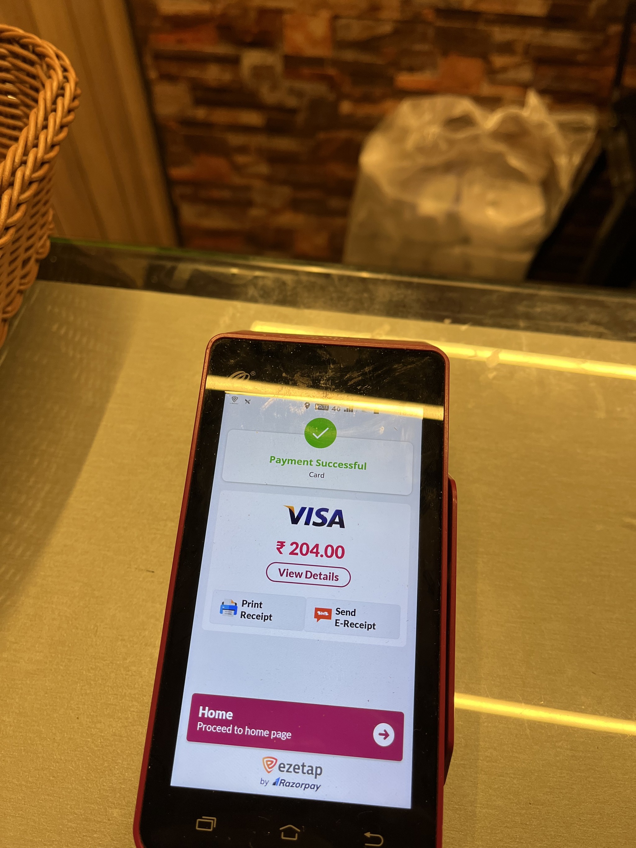
Ezetap initially provided POS payment solutions to small businesses and enterprises. Over time, as the client base expanded across multiple sectors like retail through banks, government the existing app struggled to meet the growing needs and varied use cases. In 2020, we set out to complete a redesign to transform the product into a modern, scalable platform that caters to the evolving demands of both merchants and banks. Our goal was to create a delightful, modern app that works well for everyone.
TLDR;
🚧 Key Challenges with the Previous Design
Outdated Design
Low Engagement and awareness of app features.
Limited benefits to the clients (banks & enterprises)
🔎 The design process included
Internal research, interviews, observations
IA, Iterative designs & f/b
Branding & Design system components creation
Prototyping & internal testing
🎯 Key Redesign Objectives
Feature Expansion scalability
Better Branding capabilities and design system
Advertising and cross-selling capabilities
Giving the Redesign a new identity
🙌 Impact
Increased cross-sell conversions by 30% & Reduced support calls by 22%
Enhanced daily task efficiency & feature discoverability
Attracted new merchants & customers
In a hurry? Skip to see the final designs
📅 Duration:
~6 Months (2021)
👥 Team:
Product Designer (Me), Lead Product Designer, 2 Product Managers, Product Director, Engineers, Q/A Testers, Icons Designer (External Contracter)
🦸🏻♀️️️ My Contribution:
Responsible for driving initial research to understand goals.
Conceptualisation and laid out the Design language including layout design of the homepage and selection of colours for the design system of the app.
Rapid design and prototyping to test the designs.
Designed Promotions ads experience and notifications independently end to end, and ensured the delivery of key modules and feature areas.
🚧 Key Challenges with the Previous Design
Outdated Design
Low Engagement and awareness of app features.
Limited benefits to the clients (banks & enterprises)
🔎 The design process included
Internal research, interviews, observations
IA, Iterative designs & f/b
Branding & Design system components creation
Prototyping & internal testing
🎯 Key Redesign Objectives
Feature Expansion scalability
Better Branding capabilities and design system
Advertising and cross-selling capabilities
🙌 Impact
Increased cross-sell conversions by 30% & Reduced support calls by 22%
Enhanced daily task efficiency & feature discoverability
Attracted new merchants & customers
In a hurry? Skip to see the final designs
Overview
Ezetap initially provided POS payment solutions to small businesses and enterprises. Over time, as the client base expanded across multiple sectors like retail through banks, government the existing app struggled to meet the growing needs and varied use cases. In 2020, we set out to complete a redesign to transform the product into a modern, scalable platform that caters to the evolving demands of both merchants and banks. Our goal was to create a delightful, modern app that works well for everyone.
Ezetap initially provided POS payment solutions to small businesses and enterprises. Over time, as the client base expanded across multiple sectors like retail through banks, government the existing app struggled to meet the growing needs and varied use cases. In 2020, we set out to complete a redesign to transform the product into a modern, scalable platform that caters to the evolving demands of both merchants and banks. Our goal was to create a delightful, modern app that works well for everyone.
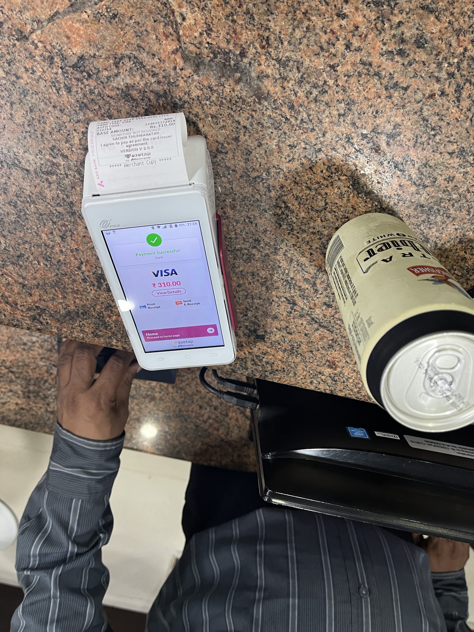
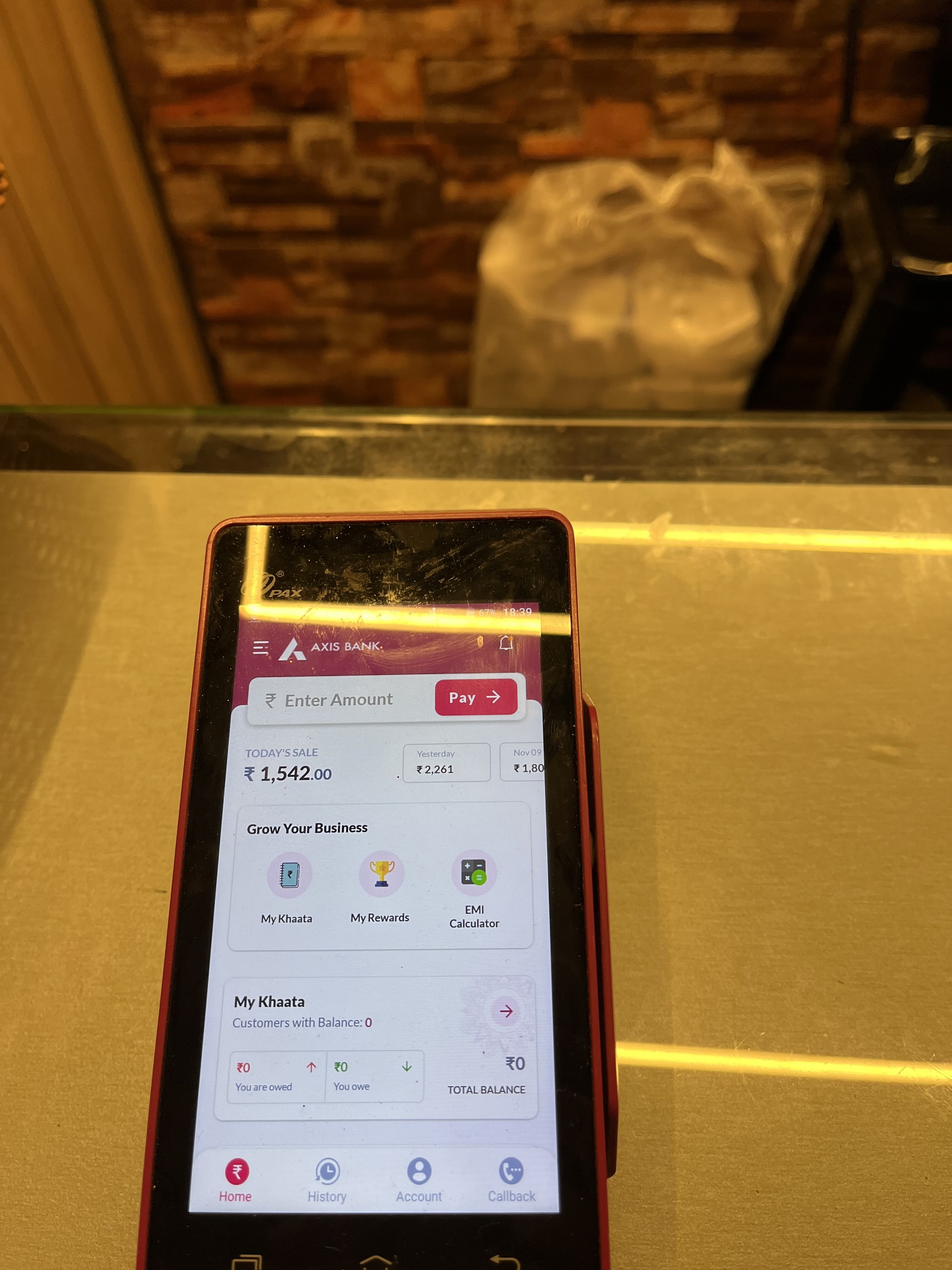
Looking at the Old Design
The initial design was more than 5 years old and didn’t have much research behind it outside attempting to surface features that were known to be frequently used.
Conversations with the marketing design team also revealed that we had an “orange on orange”, or “too much orange” problem and that there was a desire to break up the monotone look.


PROCESS
Addressing the Challenges
Need for Redesign: While leadership wanted to refresh the app’s identity, aligning the redesign with actual user needs was essential to ensure its success.
User Preferences: Our initial research for previous products revealed that users valued familiarity and ease of use, often resisting complex changes. The redesign had to enhance their experience without overwhelming them with unnecessary complexity.
Diverse User Base: With the app serving a wide range of users, including banks, enterprises, and government officials, whose percentages shifted annually, it was challenging to tailor the redesign for a single user group.
45%
45%
Retail Mercahnts
Retail Mercahnts
Banks
25%
25%
Enterprise Employees
Enterprise Employees
Enterprises
~10%
~10%
Govt. Employees
Govt. Employees
Govt
20%
20%
Others
Others
Others
The previous design didn’t have many features to work with, which made it tough to pinpoint specific problems, fix them, and test improvements. For the redesign, we wanted to do more than just refresh the look—we aimed to give it a new identity and create a solid foundation that could grow with the business and meet the needs of a more diverse user base.
High-Level Goals:
Create an Intuitive Experience: Design a user-friendly interface that caters to merchants, clients, and end users, while allowing Ezetap to seamlessly integrate new features.
Enhance Feature Discoverability and Communication: Improve visibility of key features and facilitate effective communication between merchants, clients, and end users.
Scalability and Branding Flexibility: Develop a scalable framework that supports bank branding, customisations, and future enhancements without adding complexity.
Given the absence of a clear feature roadmap, I adopted a goal-oriented research strategy to align our objectives and uncover actionable insights.
Given the absence of a clear feature roadmap, I adopted a goal-oriented research strategy to align our objectives and uncover actionable insights.
Kickoff Meeting
It was an opportunity for me to ask initial key questions to some of the most important stakeholders gathered at the meeting
"What is the vision of the re-designed solution?"
" Who will/does use our products?"
"Who do you see as your biggest competitors? Why?"
"Which customers and users are the most important to the business? Why?"
"What challenges do the design team and the business face moving forward?"
" What do our users need most?"
😷
Due to COVID-19 restrictions at this stage, direct contextual interviews with users of the Ezetap POS device were not feasible. Additionally, facing budget and time constraints, I opted to review internal documentation instead.
Internal Research & Literature Review
The design team examined internal documents, such as product marketing plans, brand strategies, & technology specifications. This helped us better understand the product roadmap and deepen our domain knowledge.
To understand our user’s needs or problems without being able to conduct contextual interviews, I decided to look at other ways to find customer and user insights
Most positive reviews were vague or generic, lacking specific details.
Gaining Insights Beyond Reviews

📞
Users kept calling the support for the smallest issues with the device
🔁
Users unable to explain device errors, to the support team unable to diagnose
😵
Customer support team unable to cope up
😤
Users unhappy with the customer service
Analysing User Reviews
After reviewing user feedback, I realised that to fully grasp our users' needs and the nuances of their experiences, it was essential to engage with team members who interact directly with our customers and users.
Tech Support
a.What do users complain/enquire about the most?
Device-related issues.
Issues with specific transactions where users experience difficulty in finding related transaction numbers when reaching out for support.
Business development
b. What do customers care about the most?
Their own branding and logo visibility.
Opportunities for cross-selling.
Understanding their day-to-day sales.
Customer success (TRAINING CALLS)
c. What common challenges are addressed during these calls?
Users being unaware of features included in their plan.
Login issues experienced by multiple users sharing a device..
Stakeholder & SME Interviews
These meetings helped us understand what the business is trying to accomplish and highlighted decision points for aligning user and business needs, adjusting our strategy based on technical and budget constraints.
Through comprehensive discussions and interview sessions, strategic goals were established to direct the project's next phases.
Understanding Opportunities for features
Recognising User Pain points
Enhancing User Satisfaction
Aligning with Business Priorities
Customer (Clients) Interviews
Understanding the customers' goals helped me shape the approach to user research effectively.
Customers provided numerous suggestions on how to enhance the product's design. It was crucial to carefully analyse these recommendations. I conducted 2 interviews, the following points were addressed:
Goals in purchasing the product
Frustrations with current solutions
Decision process for purchasing a product
Role in installing, maintaining, and managing the product
User Observations & Interviews
The observation study helped me understand how they use the POS device in natural settings. For interviews, I wanted to understand what their goals were instead of just tasks.
As Ezetap did not have many features, it was be more useful to observe Retail merchants and Observation in general regardless of which company’s POS machine they were using
The following points were addressed in the study:
Process—What did you do when you first came in today? What did you do after that?
Exception—What constitutes a typical day? What would be an unusual event?
Goals—What makes a good day? A bad day?
Opportunity—What activities currently waste your time
Priorities—What is most important to you?
Information—What helps you make decisions?
Frequency—What parts of the product do you use most?
Kickoff Meeting
It was an opportunity for me to ask initial key questions to some of the most important stakeholders gathered at the meeting
"What is the vision of the re-designed solution?"
" Who will/does use our products?"
"Who do you see as your biggest competitors? Why?"
"Which customers and users are the most important to the business? Why?"
"What challenges do the design team and the business face moving forward?"
" What do our users need most?"
😷
Due to COVID-19 restrictions at this stage, direct contextual interviews with users of the Ezetap POS device were not feasible. Additionally, facing budget and time constraints, I opted to review internal documentation instead.
Internal Research & Literature Review
The design team examined internal documents, such as product marketing plans, brand strategies, & technology specifications. This helped us better understand the product roadmap and deepen our domain knowledge.
To understand our user’s needs or problems without being able to conduct contextual interviews, I decided to look at other ways to find customer and user insights
Most positive reviews were vague or generic, lacking specific details.
Gaining Insights Beyond Reviews
📞
Users kept calling the support for the smallest issues with the device
🔁
Users unable to explain device errors, to the support team unable to diagnose
😵
Customer support team unable to cope up
😤
Users unhappy with the customer service
Analysing User Reviews
After reviewing user feedback, I realised that to fully grasp our users' needs and the nuances of their experiences, it was essential to engage with team members who interact directly with our customers and users.
Tech Support
a.What do users complain/enquire about the most?
Device-related issues.
Issues with specific transactions where users experience difficulty in finding related transaction numbers when reaching out for support.
Business development
b. What do customers care about the most?
Their own branding and logo visibility.
Opportunities for cross-selling.
Understanding their day-to-day sales.
Customer success (TRAINING CALLS)
c. What common challenges are addressed during these calls?
Users being unaware of features included in their plan.
Login issues experienced by multiple users sharing a device..
Stakeholder & SME Interviews
These meetings helped us understand what the business is trying to accomplish and highlighted decision points for aligning user and business needs, adjusting our strategy based on technical and budget constraints.
Through comprehensive discussions and interview sessions, strategic goals were established to direct the project's next phases.
Understanding Opportunities for features
Recognising User Pain points
Enhancing User Satisfaction
Aligning with Business Priorities
Customer (Clients) Interviews
Understanding the customers' goals helped me shape the approach to user research effectively.
Customers provided numerous suggestions on how to enhance the product's design. It was crucial to carefully analyse these recommendations. I conducted 2 interviews, the following points were addressed:
Goals in purchasing the product
Frustrations with current solutions
Decision process for purchasing a product
Role in installing, maintaining, and managing the product
User Observations & Interviews
The observation study helped me understand how they use the POS device in natural settings. For interviews, I wanted to understand what their goals were instead of just tasks.
As Ezetap did not have many features, it was be more useful to observe Retail merchants and Observation in general regardless of which company’s POS machine they were using
The following points were addressed in the study:
Process—What did you do when you first came in today? What did you do after that?
Exception—What constitutes a typical day? What would be an unusual event?
Goals—What makes a good day? A bad day?
Opportunity—What activities currently waste your time
Priorities—What is most important to you?
Information—What helps you make decisions?
Frequency—What parts of the product do you use most?
Goal directed Research Strategy
Kickoff Meeting
Internal Research & Literature Review
Stakeholder & SME Interviews
Customer (Clients) Interviews
User Observations & Interviews
Kickoff Meeting
It was an opportunity for me to ask initial key questions to some of the most important stakeholders gathered at the meeting
"What is the vision of the re-designed solution?"
" Who will/does use our products?"
"Who do you see as your biggest competitors? Why?"
What problem are we solving?
Who are we solving it for?
How will we measure success?
What are the risks of this re-design?
"Which customers and users are the most important to the business? Why?"
"What challenges do the design team and the business face moving forward?"
"What does intuitive mean for our specific users in this context?"
"Which user behaviours indicate that something is intuitive?"
😷
Due to COVID-19 restrictions at this stage, direct contextual interviews with users of the Ezetap POS device were not feasible. Additionally, facing budget and time constraints, I opted to review internal documentation instead.
Key Findings and Insights gathered from common themes from User Research
Key Findings and Insights gathered from common themes from User Research
Customer Support Strain:
Customer Support Strain:
Difficulty in Problem Diagnosis: High volume of support calls for minor device issues & transaction enquiries, indicating a need for better error messages.
Difficulty in Problem Diagnosis: High volume of support calls for minor device issues & transaction enquiries, indicating a need for better error messages.
Need for personalisation and customisation :
Need for personalisation and customisation :
Distributing the app through various banks required aligning its branding with each bank’s identity to generate trust, a feature lacking in the original version.
Distributing the app through various banks required aligning its branding with each bank’s identity to generate trust, a feature lacking in the original version.
Peak Usage Observations (Retail Merchants):
Peak Usage Observations (Retail Merchants):
Merchants use POS systems extensively and fast during peak hours, requiring quick and error-free transactions.
Merchants use POS systems extensively and fast during peak hours, requiring quick and error-free transactions.
Resistance to Change:
Resistance to Change:
Resistance to complex changes, emphasising the need for feature discoverability and straightforward usability.
Resistance to complex changes, emphasising the need for feature discoverability and straightforward usability.
Future-Proofing & Scalability:
Future-Proofing & Scalability:
With rapidly evolving payment tech and client’s requirement, the app needed a flexible framework to accommodate future feature integrations seamlessly.
With rapidly evolving payment tech and client’s requirement, the app needed a flexible framework to accommodate future feature integrations seamlessly.
Feature Awareness:
Feature Awareness:
Users being unaware of existing features or how could those features be useful to their business.
Users being unaware of existing features or how could those features be useful to their business.
🤔
Despite gathering key insights and detailed notes during the user research phase, it felt like something crucial was still missing to progress effectively to the next stage. I recognised that our focus had become narrow, centred primarily on tasks rather than the broader goals. To bridge this gap, I decided it was vital to step back and consider the overarching goals of all stakeholders involved, ensuring our approach aligned with the bigger picture.
Despite gathering key insights and detailed notes during the user research phase, it felt like something crucial was still missing to progress effectively to the next stage. I recognised that our focus had become narrow, centred primarily on tasks rather than the broader goals. To bridge this gap, I decided it was vital to step back and consider the overarching goals of all stakeholders involved, ensuring our approach aligned with the bigger picture.

The Users
The Users
The device is used by different personas across varying roles in businesses, healthcare, education, and the government. In addition to our direct customers, even our customers' customers (end-users) fall under our user pool.
The device is used by different personas across varying roles in businesses, healthcare, education, and the government. In addition to our direct customers, even our customers' customers (end-users) fall under our user pool.


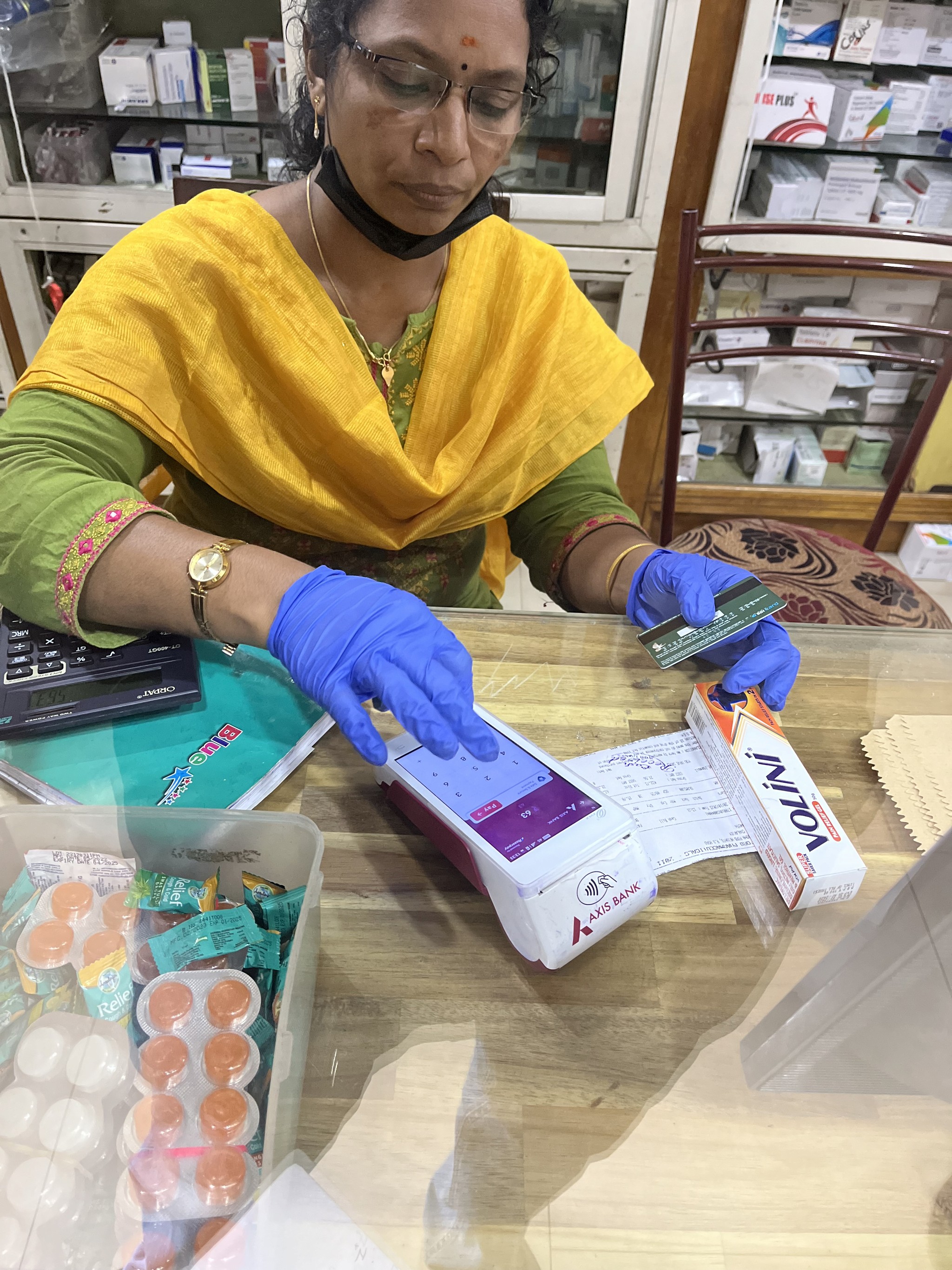
Owner/Manager (Tech savvy) of Retail Store
They integrate POS devices with their store tills, mainly for payments and business tools.
They integrate POS devices with their store tills, mainly for payments and business tools.
Retail store (small) Employees
They focus on daily tasks like processing sales and managing stock, using POS devices and P2P soundboxes for fast UPI transactions.
Enterprise Employees
They integrate their apps with the payment POS devices, using them for regular payments while assisting customers with EMIs, brand deals, and special offers.

Pharmacies, restaurants, hospitality & others
They integrate their store tills with POS devices, primarily using them for payments, valuing trust, accuracy, transaction history, and receipts.

Traffic Police/Govt employees
They primarily use the device for payments, while also utilising some of Ezetap’s additional features.

End users
Prefers quick payments and a fast checkout experience, but appreciates being informed about the best deals and offers available.
Identifying and prioritising user jobs
Identifying and prioritising user jobs
A comprehensive list of user jobs across personas by using POV statements were framed and stack ranked. Determining what made a good idea realistic was made easier by listing down the type of data requirements. This exercise laid the foundation for our MVP.
A comprehensive list of user jobs across personas by using POV statements were framed and stack ranked. Determining what made a good idea realistic was made easier by listing down the type of data requirements. This exercise laid the foundation for our MVP.
A comprehensive list of user jobs across personas by using POV statements were framed and stack ranked. Determining what made a good idea realistic was made easier by listing down the type of data requirements. This exercise laid the foundation for our MVP.
An example of a user job using POV statement for merchant to understand device status
An example of a user job using POV statement for merchant to understand device status
Actor
As a merchant,
As a merchant,
situation
When something is not working on the POS device
When something is not working on the POS device
motivation
I need to clearly see device diagnostics and other device and account details
I need to clearly see device diagnostics and other device and account details
outcome
so that I can avoid wasting time calling customer care
so that I can avoid wasting time calling customer care
Involving the extended team to the design workshops worked out wonderfully as our engineers and program managers came with deep product knowledge about the product's backend infra. This gave us diverse & comprehensive perspectives as we charted out a plan for MVP.
Involving the extended team to the design workshops worked out wonderfully as our engineers and program managers came with deep product knowledge about the product's backend infra. This gave us diverse & comprehensive perspectives as we charted out a plan for MVP.
Involving the extended team to the design workshops worked out wonderfully as our engineers and program managers came with deep product knowledge about the product's backend infra. This gave us diverse & comprehensive perspectives as we charted out a plan for MVP.

Mapping specific roles, aligning them with user journey & bucketing them
Mapping specific roles, aligning them with user journey & bucketing them
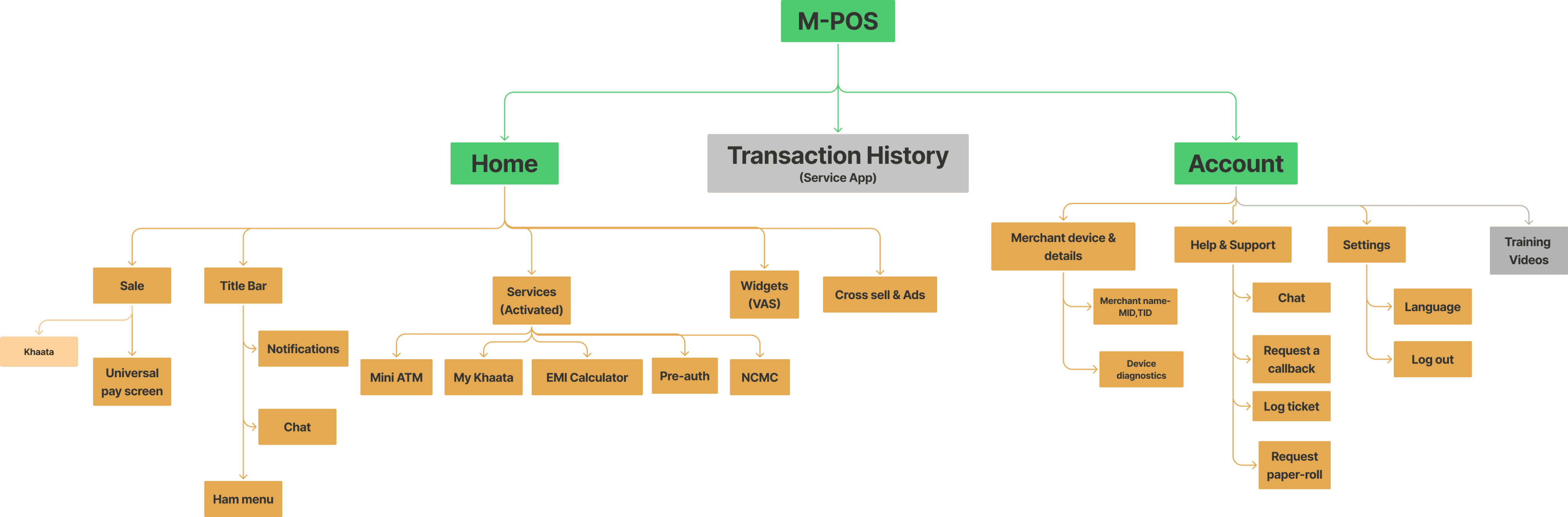
User jobs from the POV statements and conceptualisation helped us see patterns and map out the user journey into seven broad buckets. For the MVP we ideated concepts under each of these buckets.
User jobs from the POV statements and conceptualisation helped us see patterns and map out the user journey into seven broad buckets. For the MVP we ideated concepts under each of these buckets.

Sales Flow
Sales Flow
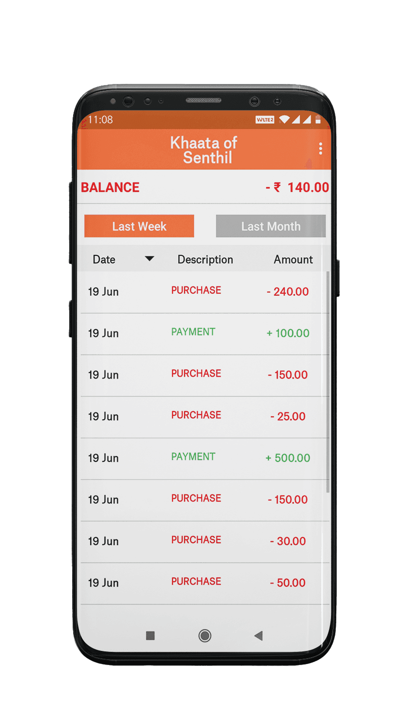
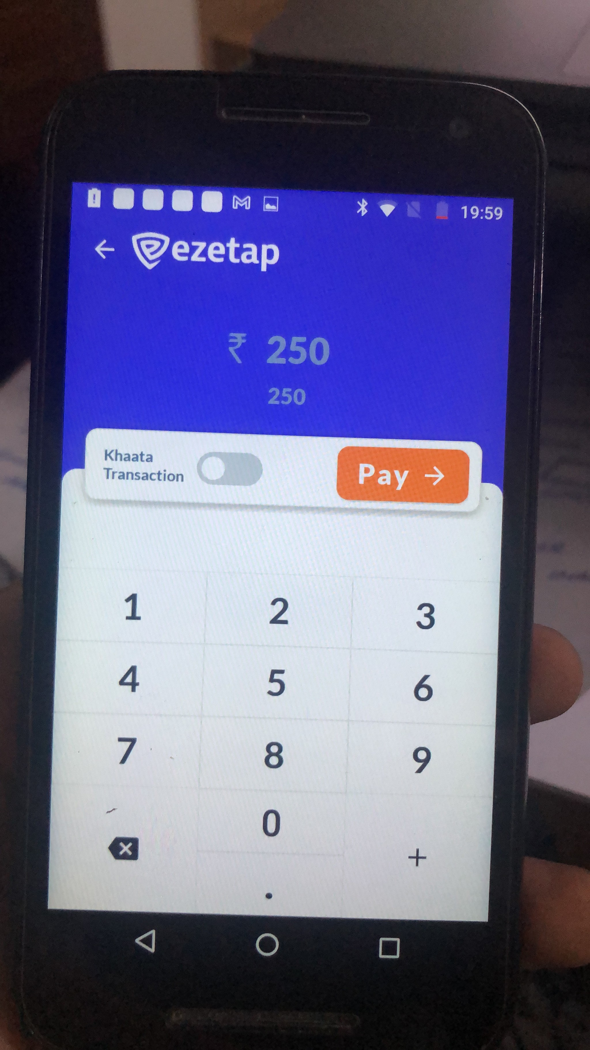
Simple intuitive sales flow, Consider ‘khaata’ use case
Features discovery & hook
Features discovery & hook
Show features in a simple way, Show snippets of what can be done
Flexibility
Flexibility
Create layouts for different use-cases (according to services activated)
Branding
Branding
Branding capabilities for clients, Create trust especially for banks
Promotions and Cross selling
Promotions and Cross selling
Promotions and cross selling for merchants as well as end customers
Transaction History
Transaction History
Intuitive design- Reduce customer support calls for transaction related enquiries, Add filters
Help and Support
Help and Support
Aim to reduce customer support calls for device related enquiries, Remove direct call options
Creating flows & Information Architecture
The flows helped us understand which screens to design and how to make the design scalable, ensuring it could accommodate additional elements or features in the future.
The flows helped us understand which screens to design and how to make the design scalable, ensuring it could accommodate additional elements or features in the future.

outcome
Final Outcome: Highlights
Each highlight captures an aspect of the re-design. It calls out which scenario or problem its solving and what the solution is.
Dynamic Button for Sales flow
PROBLEM
Previously, the Khaata (credit) feature was given too much prominence, even though it was used infrequently. This led to cognitive overload and caused confusion for users.
Previously, the Khaata (credit) feature was given too much prominence, even though it was used infrequently. This led to cognitive overload and caused confusion for users.
Previously, the Khaata (credit) feature was given too much prominence, even though it was used infrequently. This led to cognitive overload and caused confusion for users.
solution
During Khaata mode activation, the button’s colour and text dynamically adjusts to indicate the current selection. This visual differentiation and seamless flow-switching improved user comprehension and navigation.
During Khaata mode activation, the button’s colour and text dynamically adjusts to indicate the current selection. This visual differentiation and seamless flow-switching improved user comprehension and navigation.
During Khaata mode activation, the button’s colour and text dynamically adjusts to indicate the current selection. This visual differentiation and seamless flow-switching improved user comprehension and navigation.
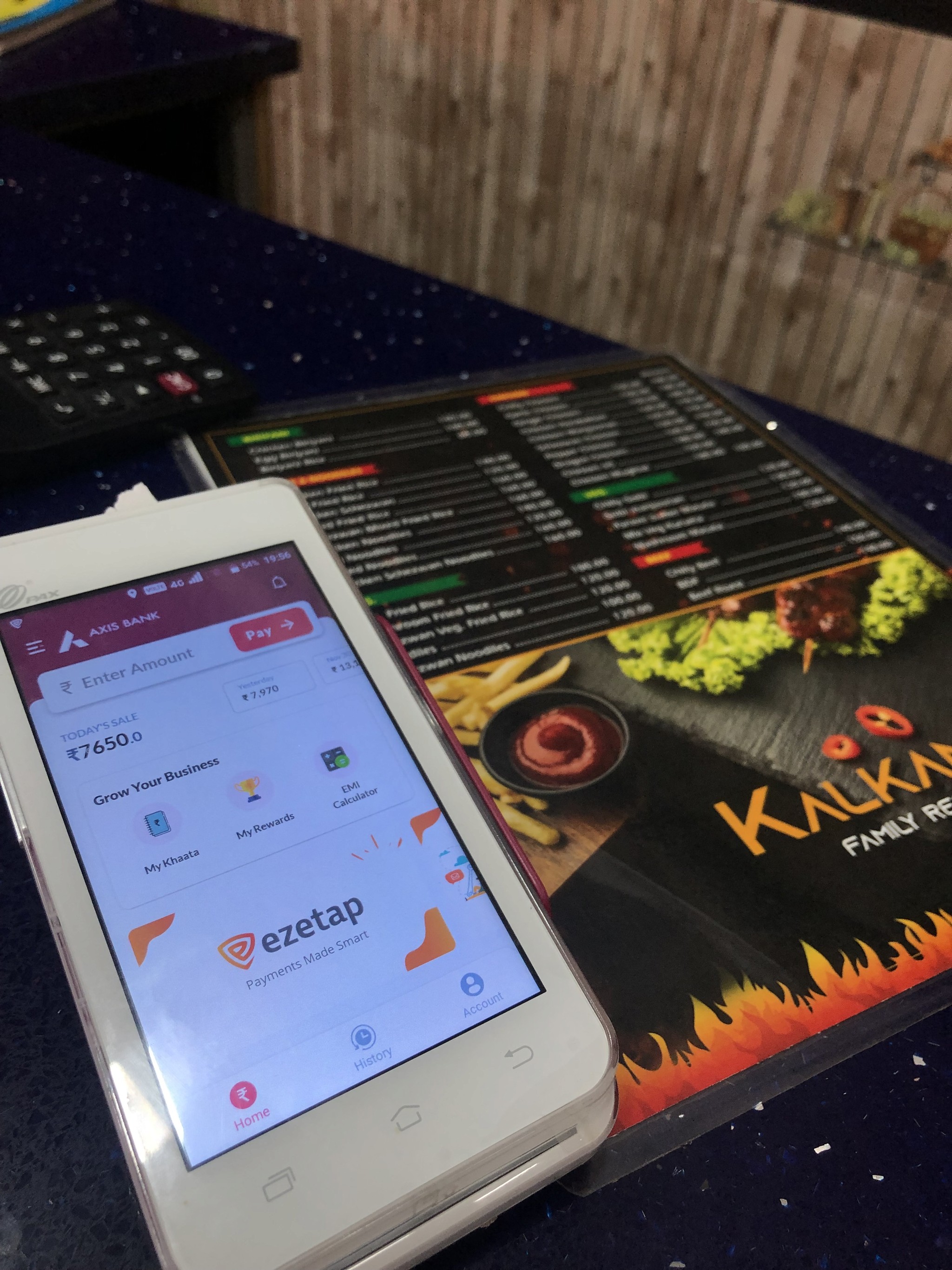
Widget based Home screen for AT-a-glance experience
PROBLEM
Many of the app’s users were merchants, and a large number were not very tech-savvy, only using the device for sales. In the previous version, most features were hidden in the hamburger menu, so the app failed to communicate or show the value of these tools effectively.
Many of the app’s users were merchants, and a large number were not very tech-savvy, only using the device for sales. In the previous version, most features were hidden in the hamburger menu, so the app failed to communicate or show the value of these tools effectively.
solution
Even though the app’s primary focus was processing payments, the expansion of features required us to provide an "at-a-glance" experience. We aimed to present key functionalities and details concisely, integrating widgets to highlight critical information upfront. Strategically placed call-to-action buttons enhanced discoverability and served as the essential 'hook' to engage users.
Even though the app’s primary focus was processing payments, the expansion of features required us to provide an "at-a-glance" experience. We aimed to present key functionalities and details concisely, integrating widgets to highlight critical information upfront. Strategically placed call-to-action buttons enhanced discoverability and served as the essential 'hook' to engage users.

Custom layouts and branding capabilities
scenario
Since Ezetap provided a SaaS payment system to major banks, a primary objective of the redesign was to ensure it met banking partners' requirements for branding, security, and customisability. Additionally, merchants and enterprises had the flexibility to activate features and services based on their specific needs, making it crucial to design a scalable system that could adapt to varied business requirements and user scenarios.
Since Ezetap provided a SaaS payment system to major banks, a primary objective of the redesign was to ensure it met banking partners' requirements for branding, security, and customisability. Additionally, merchants and enterprises had the flexibility to activate features and services based on their specific needs, making it crucial to design a scalable system that could adapt to varied business requirements and user scenarios.
solution
Our branding strategy focused on customisability and scalability, streamlining the process by reducing input fields to minimise engineering and setup efforts. This approach ensured the design stayed functional, visually appealing, and user-friendly, while allowing for easy adaptations to various business needs.
Our branding strategy focused on customisability and scalability, streamlining the process by reducing input fields to minimise engineering and setup efforts. This approach ensured the design stayed functional, visually appealing, and user-friendly, while allowing for easy adaptations to various business needs.
1 service enabled
Title : No

2 services enabled
Title : No

3-6 services enabled
Title : Yes | 1-2 rows

6+ services enabled
Title : Yes | 1-2 rows

primaryColor
#AE275F
secondaryColor
#EB1165
titlebarColor
#FFFFFF
titlebar Theme
light
homeTitlebarColor
#AE275F
hometitlebarTheme
dark
bank Logo
hdfc-logo

bank Logo Home
hdfc-logo


Promotions and Cross selling
SCENARIO
Banks and enterprises sought to use the app as a communication tool to deliver new offers and deals to end customers, while also promoting business loans and services to merchants. Their primary goal was to leverage the app for cross-selling opportunities, driving increased engagement through targeted promotions and tailored offers.
Banks and enterprises sought to use the app as a communication tool to deliver new offers and deals to end customers, while also promoting business loans and services to merchants. Their primary goal was to leverage the app for cross-selling opportunities, driving increased engagement through targeted promotions and tailored offers.
solution
We categorised the different types of promotions into three distinct categories and defined their behaviour and placement within the app to ensure maximum visibility and impact.
We categorised the different types of promotions into three distinct categories and defined their behaviour and placement within the app to ensure maximum visibility and impact.


😐
Promotion Setup & Challenges:
Banks and NBFCs enable Promotion Configuration through the merchant portal, displaying image-based promos such as seasonal discounts, loans, or payment-related offers like cashbacks and credit card promos.
Issue: When urgent deals needed to be pushed, relying on their teams to send promo images often caused delays, missing the optimal time to promote the offers effectively.
solution
The templates were specifically designed to avoid prominent brand colours, ensuring they wouldn't blend in with custom branding. This approach preserved the look of a typical image ad, while using simple text fields that could be easily updated through JSON files, allowing for seamless adaptability and quick updates.
The templates were specifically designed to avoid prominent brand colours, ensuring they wouldn't blend in with custom branding. This approach preserved the look of a typical image ad, while using simple text fields that could be easily updated through JSON files, allowing for seamless adaptability and quick updates.
The templates were specifically designed to avoid prominent brand colours, ensuring they wouldn't blend in with custom branding. This approach preserved the look of a typical image ad, while using simple text fields that could be easily updated through JSON files, allowing for seamless adaptability and quick updates.
JSON based templates
Promo Cards


opacity: 30%
apply: gradient & add: pattern svg
BUSINESS LOANS
Offer Logo
text:
Offer Caption
img/SVG:
Offer Title
Offer Type
text:
text:
Offer Type
Business Loans
Offer Title
Business loans are av...
Offer Caption (T&C)
Applicable on all ICICI Bank customers
icici- icon.png
Offer Icon (Optional)
Linked Pay Modes (None | Single | Multiple)
Card, Bank EMI, Brand EMI,
Brand Offers
Merchant Rewards
Following the success of efficient ways of cross-sells through promos, the partner banks saw an opportunity to incentivise cross selling for merchants.
Click to open the case study in Behance
Following the success of efficient ways of cross-sells through promos, the partner banks saw an opportunity to incentivise cross selling for merchants.
Click to open the case study in Behance
Following the success of efficient ways of cross-sells through promos, the partner banks saw an opportunity to incentivise cross selling for merchants.
Click to open the case study in Behance
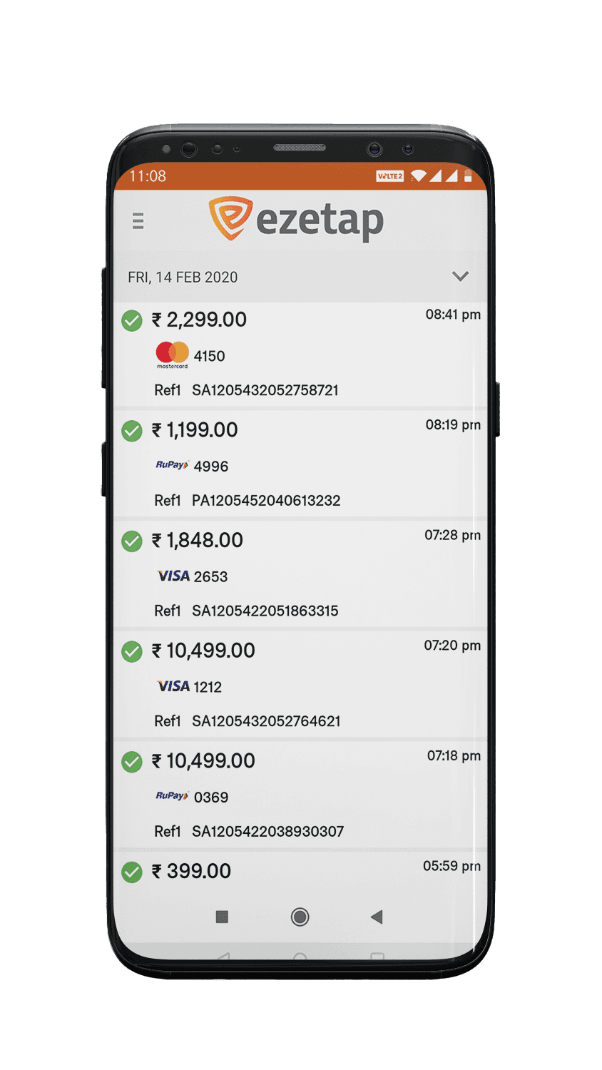
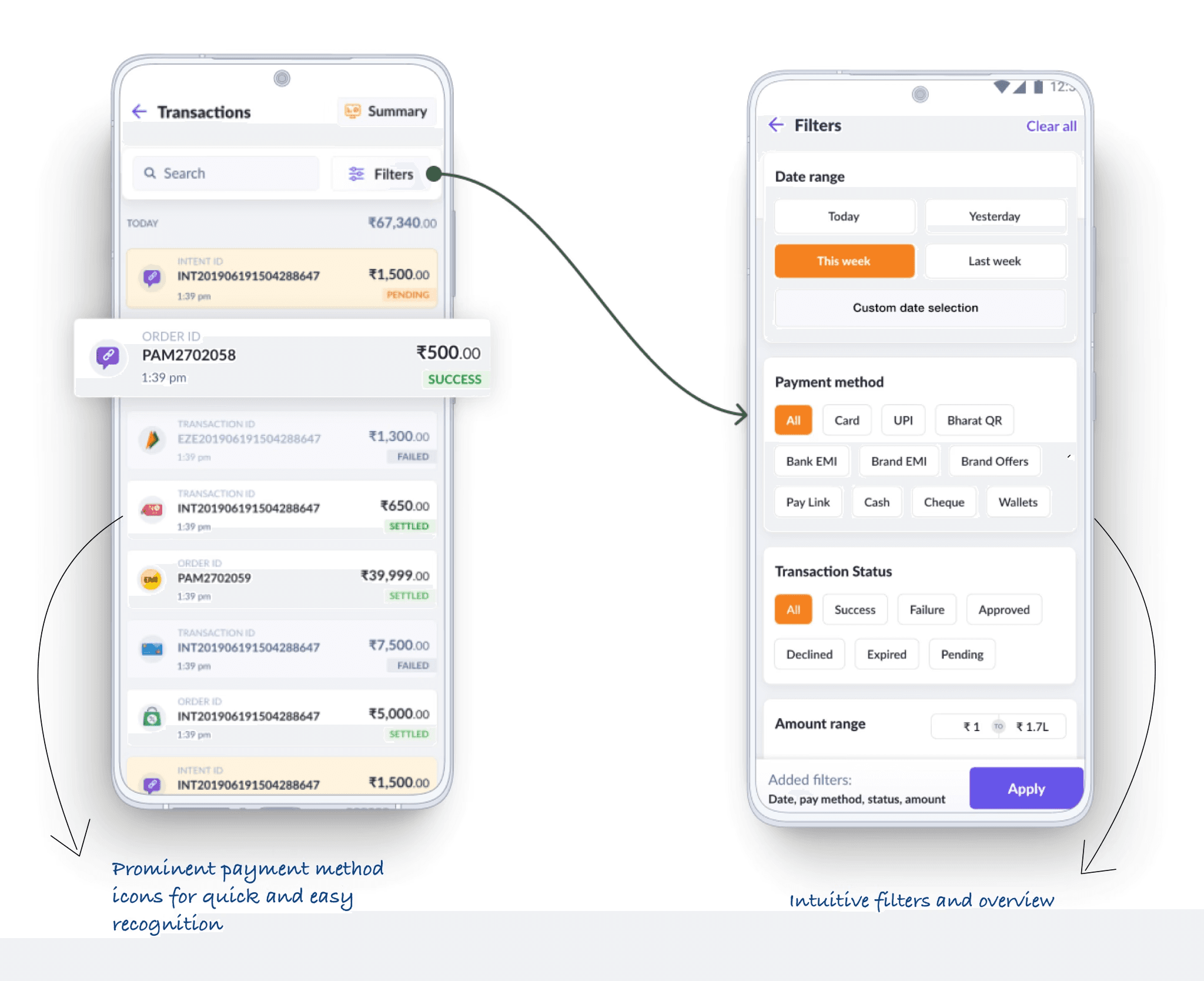
Transaction History
PROBLEM
A significant portion of customer service calls revolved around transaction history inquiries, as merchants often found it difficult to locate specific details. Although the information was available in the previous interface, it suffered from poor readability, caused by a lack of clear hierarchy and logical grouping of information.
A significant portion of customer service calls revolved around transaction history inquiries, as merchants often found it difficult to locate specific details. Although the information was available in the previous interface, it suffered from poor readability, caused by a lack of clear hierarchy and logical grouping of information.
A significant portion of customer service calls revolved around transaction history inquiries, as merchants often found it difficult to locate specific details. Although the information was available in the previous interface, it suffered from poor readability, caused by a lack of clear hierarchy and logical grouping of information.
solution
We redesigned the interface with a clear layout and colour-coded key elements to improve scannability and ease of understanding. By incorporating simplified filters and logically segmented transaction details, we created a more intuitive and user-friendly experience.
We redesigned the interface with a clear layout and colour-coded key elements to improve scannability and ease of understanding. By incorporating simplified filters and logically segmented transaction details, we created a more intuitive and user-friendly experience.
We redesigned the interface with a clear layout and colour-coded key elements to improve scannability and ease of understanding. By incorporating simplified filters and logically segmented transaction details, we created a more intuitive and user-friendly experience.

Device Details & Help and support
PROBLEM
Customer service was overwhelmed with device-related issue calls, causing long wait times for users needing genuine assistance. Reducing these calls and streamlining the support process became crucial to ease the burden on the support team.
Customer service was overwhelmed with device-related issue calls, causing long wait times for users needing genuine assistance. Reducing these calls and streamlining the support process became crucial to ease the burden on the support team.
solution
We displayed important static details like MID, TID, and app versions directly on the Account screen for easy access. A diagnostic section with large icons and colour-coded indicators was introduced for clear status visibility. Additionally, we optimised the help and support section .
We displayed important static details like MID, TID, and app versions directly on the Account screen for easy access. A diagnostic section with large icons and colour-coded indicators was introduced for clear status visibility. Additionally, we optimised the help and support section .


😐
New Problem: While the initial changes reduced call volume, a new issue emerged. Many users were raising multiple tickets for the same problem before the first one was resolved. Non-tech-savvy merchants, particularly from tier-2 cities who could not understand english well, struggled to clearly describe their issues, often due to language barriers. This led to confusion and unnecessary ticket duplication.
New Problem: While the initial changes reduced call volume, a new issue emerged. Many users were raising multiple tickets for the same problem before the first one was resolved. Non-tech-savvy merchants, particularly from tier-2 cities who could not understand english well, struggled to clearly describe their issues, often due to language barriers. This led to confusion and unnecessary ticket duplication.
New Problem: While the initial changes reduced call volume, a new issue emerged. Many users were raising multiple tickets for the same problem before the first one was resolved. Non-tech-savvy merchants, particularly from tier-2 cities who could not understand english well, struggled to clearly describe their issues, often due to language barriers. This led to confusion and unnecessary ticket duplication.
solution
We streamlined the ticketing process by allowing merchants to select the issue and sub-issue from a predefined list, with an option to add additional details if necessary. If a ticket with the same issue is already open, merchants are notified that it is being handled, preventing duplicate submissions. Additionally, we removed the "request callback" feature, as it was redundant—merchants were already contacted once a ticket was logged. This simplified approach improved clarity and efficiency.
We streamlined the ticketing process by allowing merchants to select the issue and sub-issue from a predefined list, with an option to add additional details if necessary. If a ticket with the same issue is already open, merchants are notified that it is being handled, preventing duplicate submissions. Additionally, we removed the "request callback" feature, as it was redundant—merchants were already contacted once a ticket was logged. This simplified approach improved clarity and efficiency.
We streamlined the ticketing process by allowing merchants to select the issue and sub-issue from a predefined list, with an option to add additional details if necessary. If a ticket with the same issue is already open, merchants are notified that it is being handled, preventing duplicate submissions. Additionally, we removed the "request callback" feature, as it was redundant—merchants were already contacted once a ticket was logged. This simplified approach improved clarity and efficiency.

Digital Khaata (Ledger book)
The Khaata feature of the app was designed primarily for small sized business owners to manage short-term, interest free credit for their regular trusted customers
The Khaata feature of the app was designed primarily for small sized business owners to manage short-term, interest free credit for their regular trusted customers
The Khaata feature of the app was designed primarily for small sized business owners to manage short-term, interest free credit for their regular trusted customers
Click to open the case study in Behance
Click to open the case study in Behance
Click to open the case study in Behance
Impact of the Redesign

We don’t talk anymore like we used to..
We don’t talk anymore like we used to..
Enquiries to the customer support team reduced by
22%
When engagement clicks..
When engagement clicks..
Increased overall cross sell conversions for the banks on an average by more than
30%
Turning heads and winning hearts—our redesign brought in new users and impressed the banks..
Turning heads and winning hearts—our redesign brought in new users and impressed the banks..
The launch of our redesign was met with great success, attracting new users and delighting partner banks with its enhanced user experience and polished visual design


Takeaways
My learnings
Value of Cross-Team Feedback: Regular conversations with teams like Customer Success, Business Development, and Development were invaluable. Each team brings its own perspective, and these exchanges helped me design with a holistic view, ensuring that the user experience aligns with both business and technical goals.
Every Detail Needs a Reason: Even small design decisions—like using vibrant colours for icons versus brand colours, or deciding between static and frequently-used feature placement—need clear rationale. Collaborating closely with developers prompted me to think through all interactions, such as “What happens if the screen is idle?” or “What if no tickets have been created yet?” This approach helped me sharpen my focus on micro-interactions and prepare for various use cases.
Prioritise Insights Over Process: In situations without formal research methods, I adapted by seeking insights through alternative means. This allowed me to remain grounded in real needs and outcomes rather than strictly following conventional research processes.
My learnings
Value of Cross-Team Feedback: Regular conversations with teams like Customer Success, Business Development, and Development were invaluable. Each team brings its own perspective, and these exchanges helped me design with a holistic view, ensuring that the user experience aligns with both business and technical goals.\
Every Detail Needs a Reason: Even small design decisions—like using vibrant colours for icons versus brand colours, or deciding between static and frequently-used feature placement—need clear rationale. Collaborating closely with developers prompted me to think through all interactions, such as “What happens if the screen is idle?” or “What if no tickets have been created yet?” This approach helped me sharpen my focus on micro-interactions and prepare for various use cases.
Prioritise Insights Over Process: In situations without formal research methods, I adapted by seeking insights through alternative means. This allowed me to remain grounded in real needs and outcomes rather than strictly following conventional research processes.
Reflecting on What I Could Have Done Differently
Early Focus on Data and Functional Needs: Considering data and functional requirements from the outset would have helped me build a more seamless, scalable design, preempting potential adjustments as the project progressed.
Challenge Assumptions: Relying on assumptions can often obscure underlying issues. Although usability testing wasn’t always feasible post-research, there were times we moved forward with features based on prior tests and assumptions. As a designer, it’s essential to advocate for even small-scale beta testing to proactively catch issues, avoiding costly redesigns and ensuring the design truly meets user needs from the outset.
Have a project in mind?
I can help designing a website, designing a new product, improving an existing part of your product, or help you to improve your web accessibility.
Have a project in mind?
I can help designing a website, designing a new product, improving an existing part of your product, or help you to improve your web accessibility.
Have a project in mind?
I can help designing a website, designing a new product, improving an existing part of your product, or help you to improve your web accessibility.