User-Centric Notification Design for LSEG: Enhancing Accessibility and Scalability

User-Centric Notification Design for LSEG: Enhancing Accessibility and Scalability

User-Centric Notification Design for LSEG: Enhancing Accessibility and Scalability

This case study explores the design of a user-centric notification system and component for LSEG's design system, streamlining the CMS management experience while prioritising accessibility and scalability.

This case study explores the design of a user-centric notification system and component for LSEG's design system, streamlining the CMS management experience while prioritising accessibility and scalability.

This case study explores the design of a user-centric notification system and component for LSEG's design system, streamlining the CMS management experience while prioritising accessibility and scalability.

📅 Duration:

6 Weeks (2024)

👥 Team:

Product Designer (Me), Product Manager, 3 Backend & CMS Engineers, 2 Web Publishers

🧐 CHALLENGE:

Previously, there was no single, consistent way to communicate important messages. Different components like banners and grey boxes were used, but they lacked flexibility and customisation.

These methods often disrupted the user experience and made it difficult for web publishers to manage notifications efficiently.

The challenge was to design a scalable, accessible notification system that improved communication and integrated seamlessly with the CMS for easier management.

🦸🏻‍♀️️️ My Contribution:

Opportunities discovery | UX Research and Analysis | UI design | Stakeholders pitching

As part of a cross-functional team, including some contracted members, I managed the project from start to finish as a UX designer.

Context

So what was the problem?

The Developer Community section of the LSEG website faced significant challenges in effectively communicating crucial updates to end users. The existing notification methods could not effectively convey important information, which impacted the overall user experience.

  1. Banner Usage:

Updates were displayed through a large, fixed banner with a dark grey background at the top of the page. While this method was effective in delivering necessary information, it often blocked other important content, hindering the user's journey through the site.

  1. Alerts for Critical Issues:

Critical alerts were signalled with a default red toast notification, reserved for urgent issues like security breaches or system failures, feature deprecations. This limited the alerts' utility and contributed to a poor user experience due to the lack of visual appeal and customisation options.

Initial Scope

The Developer Community team needed a solution that leveraged existing design components to effectively communicate important updates to end users. This solution needed to have the ability to deliver multiple messages and updates on a single webpage without disrupting the normal user journey.

Flexibility

Flexibility

Multiple Notification Capability

Multiple Notification Capability

Minimal Intrusiveness

Research & discovery

Understanding specific usage context

Merely identifying relevant design system components and recommending them for notifications was insufficient.

Why was this approach inadequate, and what impact does it have?

It was important to understand the specific contexts in which the notifications would operate. For example, how they would appear on different types of web pages and their behaviour on pages with dense information compared to those with minimal content.

To identify suitable components for alerts and notifications and to grasp the broader challenges, extensive research was conducted. The discovery phase incorporated insights from various sources:

  1. Review and Analysis of Feedback Channels:

  1. Review & Analysis of Feedback Channels:

To ensure the solution directly addresses user needs, I analysed existing end-user inquiries from the customer service department along with Jira tickets documenting issues raised by website users. This review helped identify common pain points and areas needing attention in the notification system.

To ensure the solution directly addresses user needs, I analysed existing end-user inquiries from the customer service department along with Jira tickets documenting issues raised by website users. This review helped identify common pain points and areas needing attention in the notification system.

To ensure the solution directly addresses user needs, I analysed existing end-user inquiries from the customer service department along with Jira tickets documenting issues raised by website users. This review helped identify common pain points and areas needing attention in the notification system.

Merging relevant user enquiries and Jira ticket issues

Merging relevant user enquiries and Jira ticket issues

Merging relevant user enquiries and Jira ticket issues

Key Findings:

The review revealed broader issues that extended beyond the Developer Community section, impacting various aspects of the platform including updates, legal compliance, and marketing communications.

The review revealed broader issues that extended beyond the Developer Community section, impacting various aspects of the platform including updates, legal compliance, and marketing communications.

The review revealed broader issues that extended beyond the Developer Community section, impacting various aspects of the platform including updates, legal compliance, and marketing communications.

Notification Management:
  • Notification banners occasionally obstruct important interface elements, complicating navigation.

  • Users see same announcements for the same event on multiple pages, leading to annoyance.

  • Mixed messages from various notifications can confuse users.

Technical Updates:
  • Updates to legal and compliance-related content are not always communicated clearly, raising potential compliance issues.

  • Information about improvements following maintenance activities is not adequately shared with users, missing an opportunity to boost user confidence and satisfaction.

  • Updates to legal and compliance-related content are not always communicated clearly, raising potential compliance issues.

  • Information about improvements following maintenance activities is not adequately shared with users, missing an opportunity to boost user confidence and satisfaction.

Marketing & Communication:
  • Information about new API updates or features is not consistently communicated, leaving users uninformed about available tools and updates.

  • Key events like webinars are not promoted sufficiently, affecting participation rates.

  • Marketing banners are sometimes perceived as a little aggressive, disrupting the user experience.

Notification Management:
  • Notification banners occasionally obstruct important interface elements, complicating navigation.

  • Users see same announcements for the same event on multiple pages, leading to annoyance.

  • Mixed messages from various notifications can confuse users.

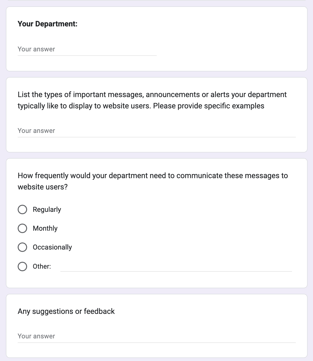
  1. Interviewing Web Publishers:

To understand how important messages are communicated on the website, I conducted two 30-minute interviews with web publishers. These discussions highlighted several challenges:

  • Manual Processes: They were required to manually enter and distribute notifications across necessary webpages and also delete them when no longer needed.

  • Lack of Customisation: The system offers no options for customisation, limiting how messages are presented and managed.

  • Operational Inefficiencies: These manual and rigid processes make it difficult to manage and implement updates effectively, pointing to a need for a more streamlined and flexible system

    To deal with this web publishers often pushed the same announcement/message on multiple pages of similar types, which as found in analysis above, can cause annoyance to end users.

Project Scope Expansion

Following initial research, I met with UX team leads to discuss identified challenges. It was clear that adapting existing design components wouldn't address issues like visual intrusiveness, inflexibility for CMS integration, and design compatibility.

In stakeholder discussions, I emphasised the need for a new adaptable component to enhance scalability and overall usability across the website.

DESIGN PROCESS

Defining Objectives and Ideation

To frame design challenges and opportunities, it was important to understand the needs of different departments across LSEG who will be using the component to communicate notifications to the end website users

DESIGN PROCESS

Defining Objectives and Ideation

To frame design challenges and opportunities, it was important to understand the needs of different departments across LSEG who will be using the component to communicate notifications to the end website users

Defining Objectives
Understanding needs of other departments
Card sorting the Responses
Establishing Categories
Ideation

Defining Objectives

Now with the extended scope, a list of ‘How Might We…’ questions was created to help us better align with our user’s needs and organisation’s goals:

  • How might we design a notification system that provides clear, actionable information, respecting both urgency and relevance, while ensuring accessibility for all users?

  • How might we ensure our notification system components are useful and adaptable across various departments while maintaining consistency with our brand’s tone and visual identity?

  • How might we make the creation and management of notifications more user-friendly for content managers and web publishers?

Final Outcome

Component Design and its Guidelines

Based on our research and discussions, we identified several important features for the notification system:

  • Dismissible Notifications: Users should be able to dismiss notifications, with an option in the CMS to keep them non-dismissible when needed.

  • Two Types of Notifications: The system should support notifications that appear either on specific pages or across the entire site/product.

  • Expiry Date in CMS: Notifications should have an expiry date that can be set in the CMS, so they automatically disappear when no longer relevant.

  • Cookie-Based Dismissal: Once a user dismisses a notification, it shouldn't appear again unless their browser cookies are cleared.

Component Anatomy

Notification Banner Design Component

Best Practice and Examples

Best practice

Quick tips

Push only important notifications on each page

Make sure the type of notification is correctly understood as the colour and the position depends on it

Do not use buttons and and too many inline links all at once. Choose which CTA suits your use case best.

If the purpose of the call to action is to take the user to a generic destination for informative purposes, consider using a inline link in the description instead

Do

Don’t

Accessibility

Accessibility guidelines for the component in context

Accessibility guidelines were developed for the notification component, addressing the needs of both engineering and design teams.These guidelines ensured that the component is inclusive and meets the diverse requirements of all users.

Screenreader Requirements
Tabbing Order
Priority of Announcement

Screenreader Requirements

  • Ensure that the component is operable by keyboard and clearly indicated to screen reader users.

  • It is not necessary to describe the visual attributes (e.g. colour or pattern) of the component

CMS UX

Designing for the Web Publishers

In designing the notification system, a key focus was on the needs and workflows of the web publishers who would manage the notifications for a more intuitive and efficient system.

Defining Objectives

Now with the extended scope, a list of ‘How Might We…’ questions was created to help us better align with our user’s needs and organisation’s goals:

  • How might we design a notification system that provides clear, actionable information, respecting both urgency and relevance, while ensuring accessibility for all users?

  • How might we ensure our notification system components are useful and adaptable across various departments while maintaining consistency with our brand’s tone and visual identity?

  • How might we make the creation and management of notifications more user-friendly for content managers and web publishers?

Understanding needs of other departments

As the project expanded to include all departments, it became essential to thoroughly understand each department's notification needs.

To collect this data efficiently, a simple form was sent out to various teams, allowing them to specify the types of messages and notifications relevant to their operations. This helped me gather necessary information quickly and effectively without the need for lengthy meetings or extensive email exchanges.

Card sorting the Responses

We sorted responses from the form using card sorting techniques, merging similar responses and removing duplicates. Feedback from customer service inquiries and Jira tickets was also analysed.

In the first sprint, teams categorised the feedback to identify the necessary notification types across departments, ensuring the new component was broadly applicable. Most notifications were occasional, with some serving as product-wide announcements relevant to all API pages.

Establishing Categories

Based on the findings, I categorised the types of notifications and discussed it with teams to make sure that theres no ambiguity in the naming.

  • Critical alert (Red) - Alerts for critical system failures, security issues, or emergency maintenance.

  • Important notices (Yellow) - Notifications regarding important deadlines or service interruptions.

  • Informational Updates (Grey) - Updates on non-critical changes or general information.

  • Positive Updates (Green) - Messages that highlight positive developments or new features.

    The colours were chosen from the design library and position of the notifications based on their type was decided

Ideation

Based on the findings, I explored potential features for the notification system, taking into consideration both the user experience within the CMS and accessibility requirements.

reflection

Challenges and Constraints

  • This project was quite different from most projects I've worked on before because it didn't use the usual design workflow like user interviews, creating personas, site maps, or user testing. Instead, every decision came from interpreting research data and lots of discussions and collaborations with various teams.

  • A few roadblocks I ran into included not always knowing where to find relevant data for the research. As the team was big and spread across different time zones, it wasn't always straightforward to just schedule a call to clarify things in the set timelines. Also, we were working on this during the holiday season, so coordinating times when everyone was available was challenging.

  • Navigating the structural complexities of a large organisation was particularly challenging. Adhering to fixed budgets, securing necessary approvals, and working within server constraints often slowed down progress. This required me to repeatedly present and justify adjustments to the project's scope to senior stakeholders, ensuring each change was clearly aligned with our goals and limitations.

My Learnings

  • Taking Initiative: Sometimes, there isn’t a clear path laid out for research, especially when there is no direct access to end-users. I learned to be proactive, seeking out information and insights wherever I could find them.

  • Importance of Research and Data: Expanding the project scope from developers community pages to cover all financial information pages at LSEG emphasised presenting solid research and data to stakeholders in securing their support for the changes.

  • Accessibility from the Start: Designing with accessibility in mind right from the start saved us a lot of time. It’s something that needs to be integrated into the process from the beginning, not to be treated as an afterthought.

  • Improving Internal UX: It’s not just about the end users. The people who have to manage and deploy the system, like web publishers, need a good user experience too. If their side of the system is clunky, it eventually impacts all user.

  • Effective Communication: Initially, reaching out to team members across different departments was daunting. However, I found that most people are quite open to discussing their views if you approach them the right way, which really helps in making more informed decisions.

Have a project in mind?

I can help designing a website, designing a new product, improving an existing part of your product, or help you to improve your web accessibility.

Have a project in mind?

I can help designing a website, designing a new product, improving an existing part of your product, or help you to improve your web accessibility.

Have a project in mind?

I can help designing a website, designing a new product, improving an existing part of your product, or help you to improve your web accessibility.